Money should never be a source of anxiety. With this innovative vision, Nua Carebank — a new generation online bank — entrusted Prizm Studio with the creation of its visual identity. As a pioneer in financial well-being, the brand wanted to break away from the cold, rigid, and often stressful image associated with traditional banking institutions.
To bring this “Carebank” philosophy to life, our agency designed a branding universe centered around serenity, transparency, and balance. We drew inspiration from the calming movement of flowing water — a perfect metaphor for healthy budgeting and seamless financial management.
Our art direction and brand strategy focused on several key elements:
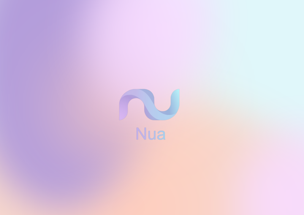
- Logo design: An organic emblem with continuous curves, created to embody serenity and reassure users throughout their banking experience.
- Custom color palette: Moving away from traditional institutional blues, we developed a dreamlike visual universe blending soft lavender tones with airy cyan shades. These pastel colors, enhanced with subtle gradients inspired by water ripples, instantly create a feeling of trust and calm.
- Brand guidelines and UI/UX design: We built a complete visual ecosystem rooted in a mobile-first approach. The banking app was designed as a true digital wellness space, encouraging peace of mind with every login.
- Brand applications: The identity was adapted across a variety of physical and digital media, from minimalist bank card concepts to mockups for future advertising campaigns.
Through this global branding project, Prizm Studio gave Nua Carebank a caring, modern, and deeply human image — redefining customer experience standards within the finance industry.